A lot of people are overwhelmed at the thought of data analytics. Between your association management system (AMS), learning management system (LMS), email platform, website, event software, app and more, you’re sitting on a wealth of data—perhaps to the point of not knowing where to start. Or maybe you are using your data but know you could be getting so much more out of it.
The value in all that data comes down to the questions it can answer for you. Associations want to know things like:
- Which of our members are more likely to renew—and who are we losing?
- Are our marketing campaigns working or are we going in circles?
- Which of our programs matter most to our members, and which should we sunset?
- Are some of our courses more likely to lead to future purchases? Are some of them dead ends?
So what data is the most valuable for answering these questions?
Define What Success Looks Like
The first step is to figure out what success looks like for your association. What are your goals? For example, you might want to grow your membership, improve renewal rates, generate more revenue through your learning programs, improve member engagement and so on. Internally, you could be looking for initiatives to retire because they don’t generate the return on time and money invested that you want.
Determining Value With Data Visualization
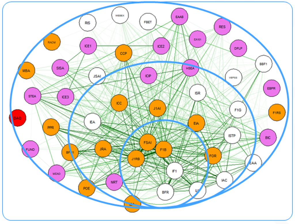
The true value of a course or learning program isn’t limited to the number of people who enroll or the amount of revenue it generates. It’s also about who those people are and what else they are doing with your association. In other words, it’s about the journey. Doing what’s called a network analysis lets you visualize all your courses, events and products, and the interactions between them.

This allows you to map the journey and identify the courses that draw people in, which ones they’re likely to do next, and what other products and events are associated with each pathway. You can distinguish how engagement changes based on role and career stage. Looking at this data over time lets you identify trends that help you make strategic decisions about where to focus your resources. Let’s consider a few examples.
Courses
Let’s say you sell courses and certifications, and through your data visualizations you discover that there are a handful of courses that reliably lead to people enrolling in your certification program, while the journey for another group of courses is more of a “one and done.” If one of your goals is to increase certifications and the continuing education credits to maintain them, maybe you want to look at discounting that first set of courses or even making them a membership benefit. Meanwhile, you can look at the members who tend to engage with the second set of courses and see whether there’s a way to extend that journey, or maybe you’ll decide that the resources you’re putting into them are better directed to other more valuable streams.
Marketing
The way you’ve designed your marketing campaigns, members who are close to completing a course are enrolled in an email campaign promoting additional courses, and those emails go out monthly. But they have a terrible open rate—or an above-average opt-out rate. Looking at your data, you discover that the overwhelming majority of people who complete a course wait six months before signing up for another. With that in mind you can send fewer, more targeted emails when members are ready to read them, not when you want to market to them.
Events
Maybe you host an annual conference and several smaller regional events each year. Identifying patterns in who is attending and what they are interested in can help you focus the content. Perhaps you discover that student and early career members tend to attend the virtual stream of hybrid events, while professional members who have your certification attend in person. This allows you to schedule the most relevant sessions and activities in the most appropriate ways. With the right data you can determine which events give you a better return and which ones to scrap altogether.
Get More Out of Your Data
Compiling all the data across your digital ecosystem into visualizations makes the information infinitely easier to use. You can map out and understand member journeys so you can make better decisions on how to provide value to those members.
I’ll be speaking at the D2L Association Executive Symposium in Washington, D.C., on November 29. Join me there to learn more about generating useful insights from your data.
Written by

Mark has dedicated his entire professional career to building relationships with clients and partners based on trust, great solutions and a shared mission to advance the association market. Mark is an expert at growing up-and-coming companies into name brands by committing to industry thought leadership, building company culture and developing client-focused sales organizations. Mark was recently named 2022 Association Partner of the Year – Salute to Association Excellence. As president and CRO for Association Analytics, Mark oversees sales, marketing, partnerships, operations and contracts.
Stay in the know
Educators and training pros get our insights, tips, and best practices delivered monthly